Greenhouse OTUs
Jailene Gonzalez and Hannah Rappaport
Last updated on 2020-07-31
Top 10 Most Abundant OTUs
Figure 1: Top 10 OTUs SAR Composition
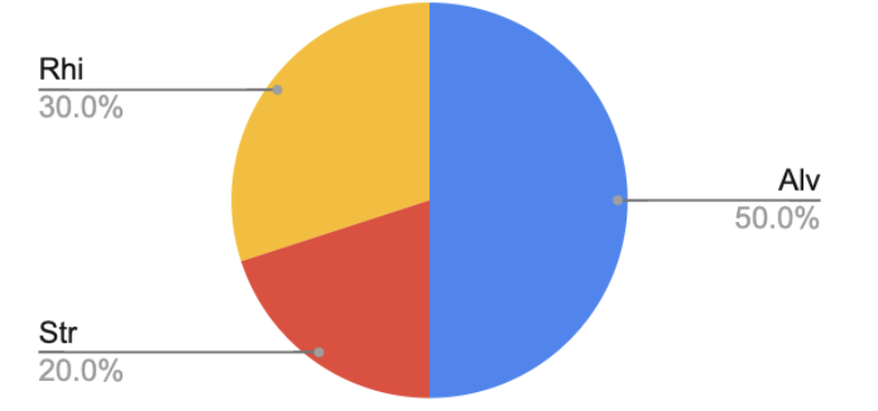
Figure 2: Greenhouse Top 10 OTUs
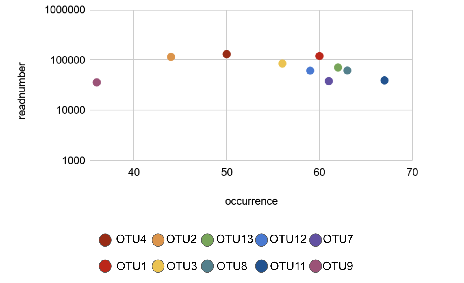
Figure 3: Readnumber vs. Occurrence of all OTUs
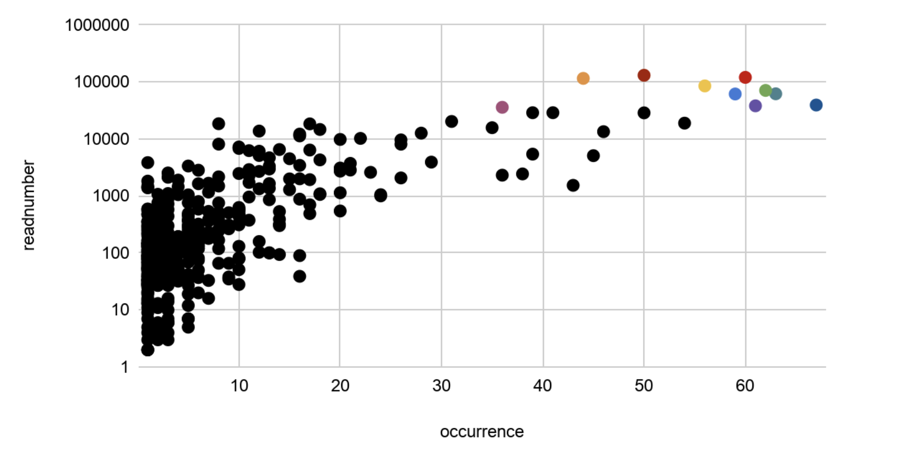
Figure 4: Presence of Top 10 Greenhouse OTUs
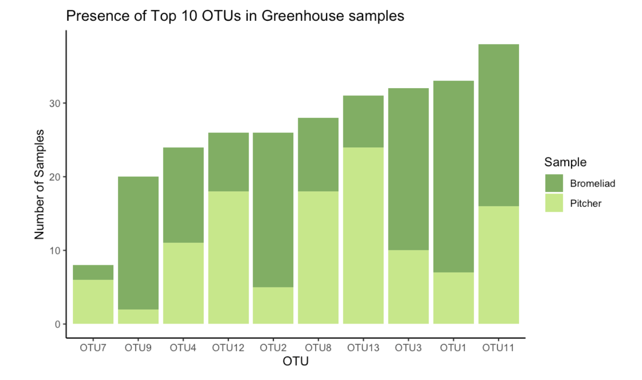
 #Data visualization comparing Pitchers and Bromeliads in one bar plot
 ## Creating new data frame using .csv file
 Greenhouse_10_OTU <- read_csv("Greenhouse_10_OTU.CSV")
 Code to create bar plot
 ggplot(data = Greenhouse_10_OTU, mapping = aes(x = reorder(OTU,Occurrences), y = Occurrences, fill = Sample)) +
 theme_classic()+
 xlab("OTU")+
 ylab("Number of Samples")+
 ggtitle(label="Presence of Top 10 OTUs in Greenhouse samples")+
 scale_fill_manual(values = c("#81ae64","#c7e78b"))+
 geom_col()
More Information on Top 10 OTUs
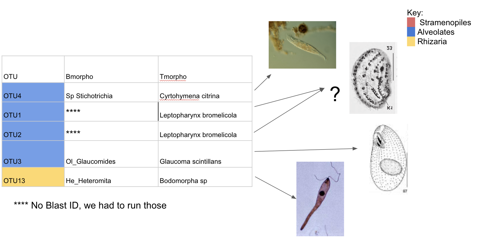
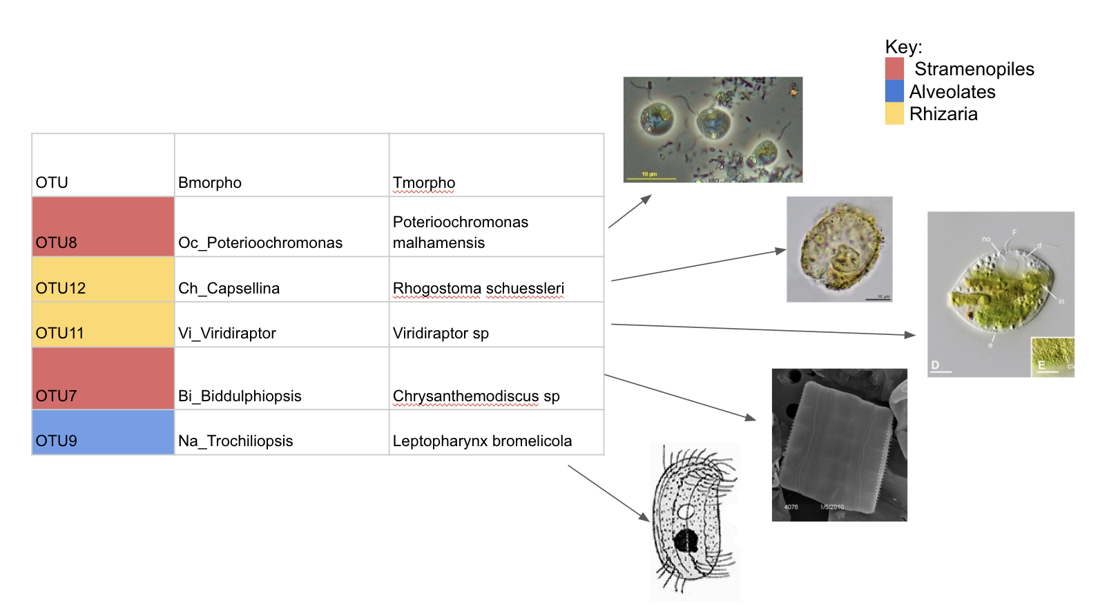
OTUs in both Bromeliads and Pitchers
Figure 1: SAR Composition of the 153 OTU’s observed (Readnumbers)
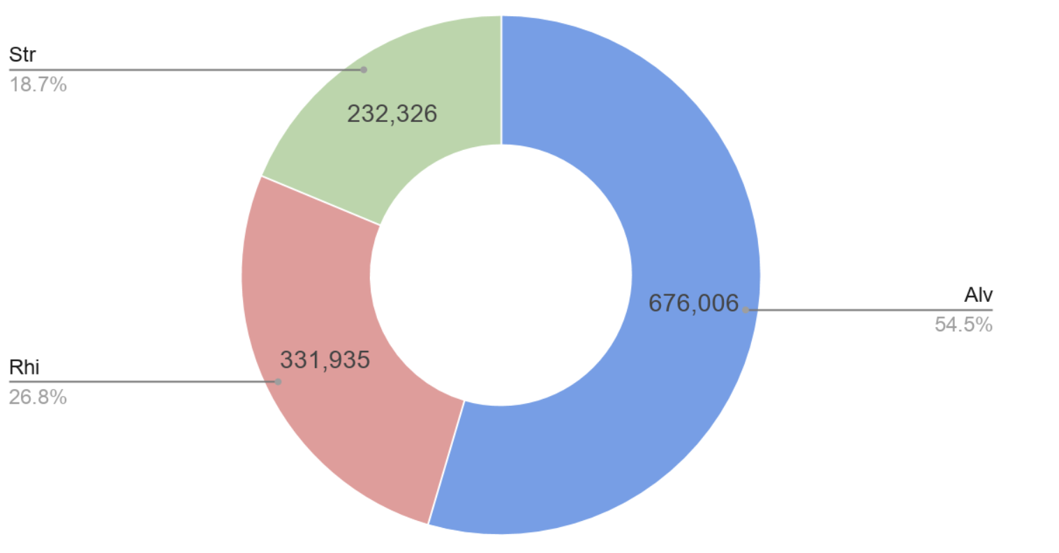
Figure 2: SAR Composition of the 153 OTU’s observed (Occurrences)
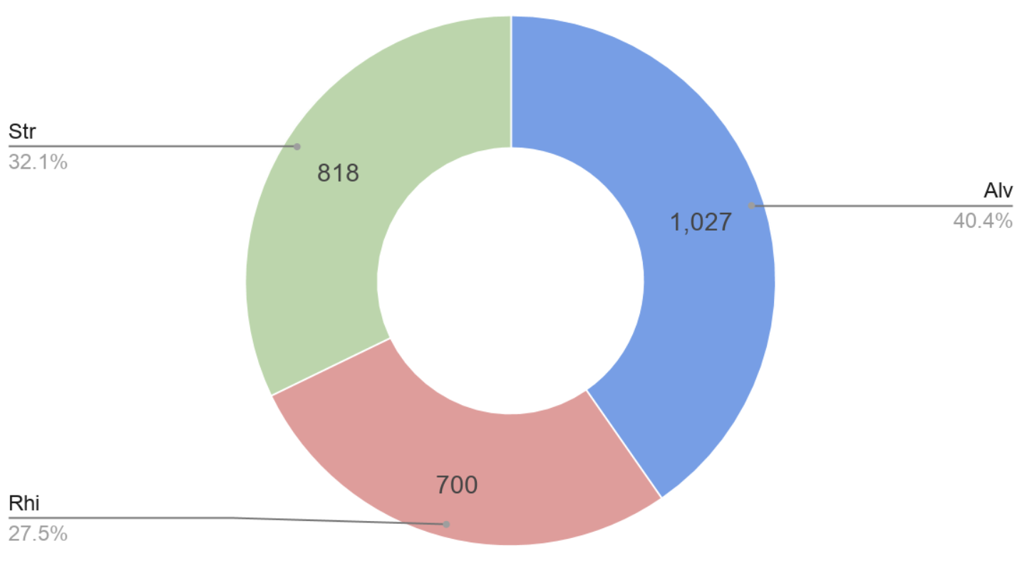
Figure 3: Readnumber vs Occurrences (DNA & RNA)
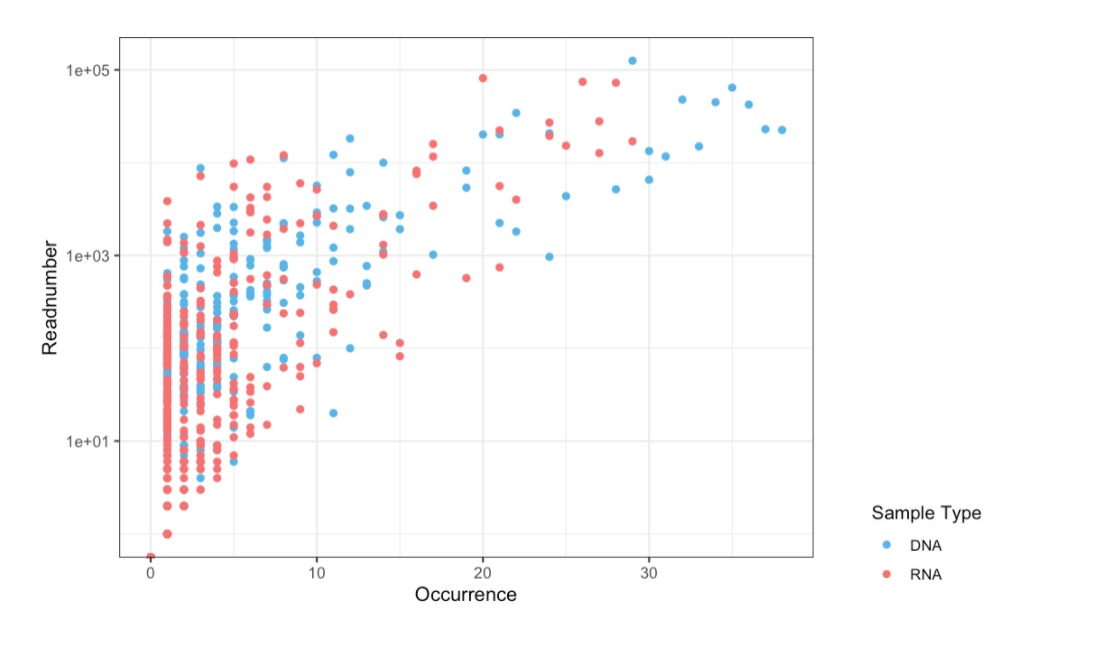
Figure 4: Split PCoA of Greenhouse Samples
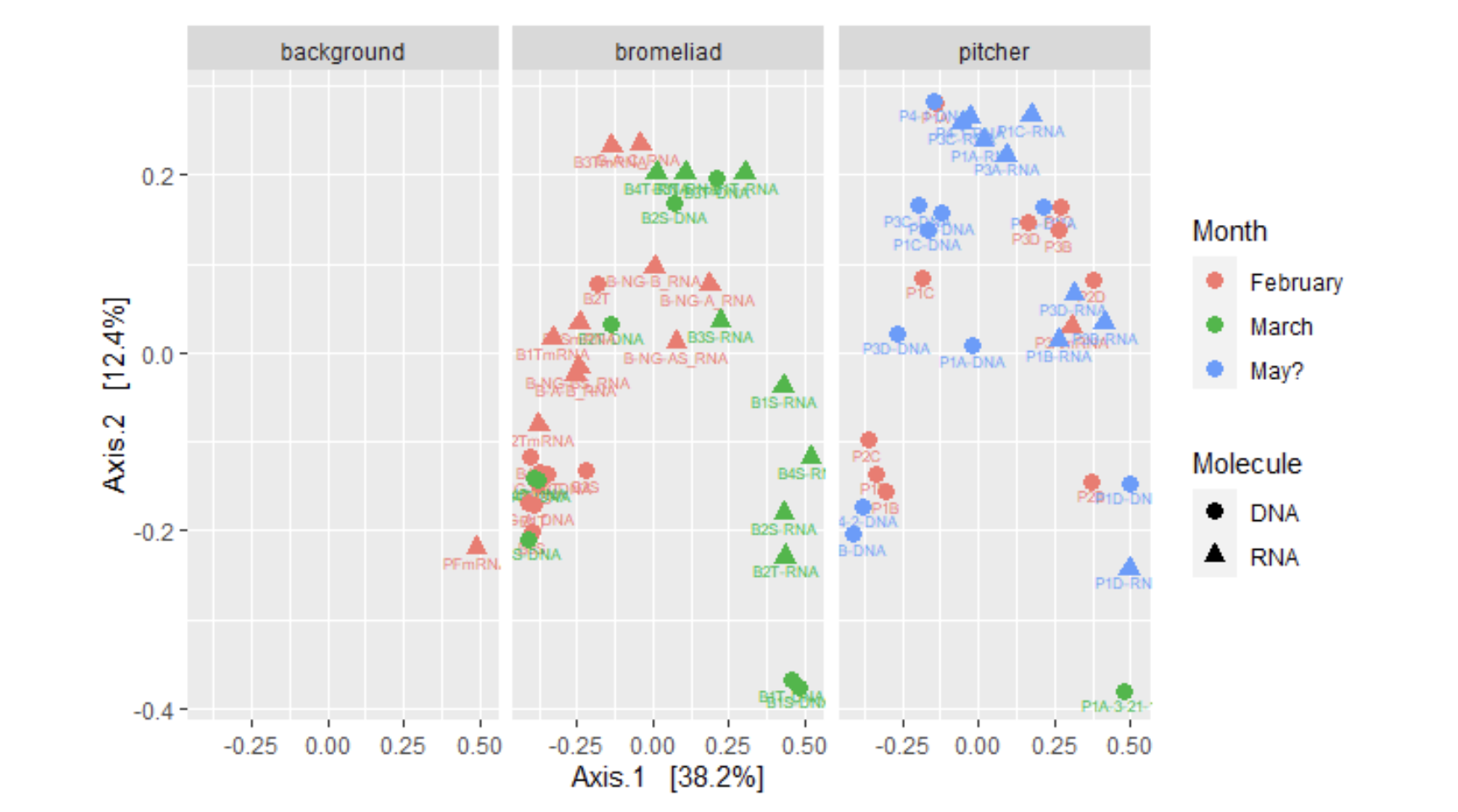
ordi <- ordinate(mergedtree, method = "PCoA", distance = "Unifrac", weighted = TRUE)
pcoa_pitcher = plot_ordination(mergedtree, ordi, color = "Month", shape = "Molecule", label = "Names")
facet_wrap(~ Plant_type)
#Print it
pcoa_pitcher + geom_point(size = 3)
Figure 5: PCoA of Greenhouse Samples
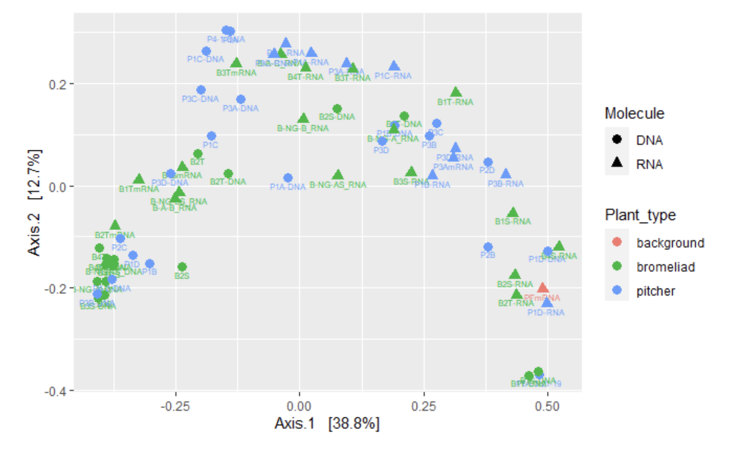
ordi <- ordinate(mergedtree, method = "PCoA", distance = "Unifrac", weighted = TRUE)
pcoa_pitcher = plot_ordination(mergedtree, ordi, color = "Plant_type", shape = "Molecule", label = "Names")

#Print it
pcoa_pitcher + geom_point(size = 3)
Figure 6: Heatmap of Bromeliads vs Pitcher Samples
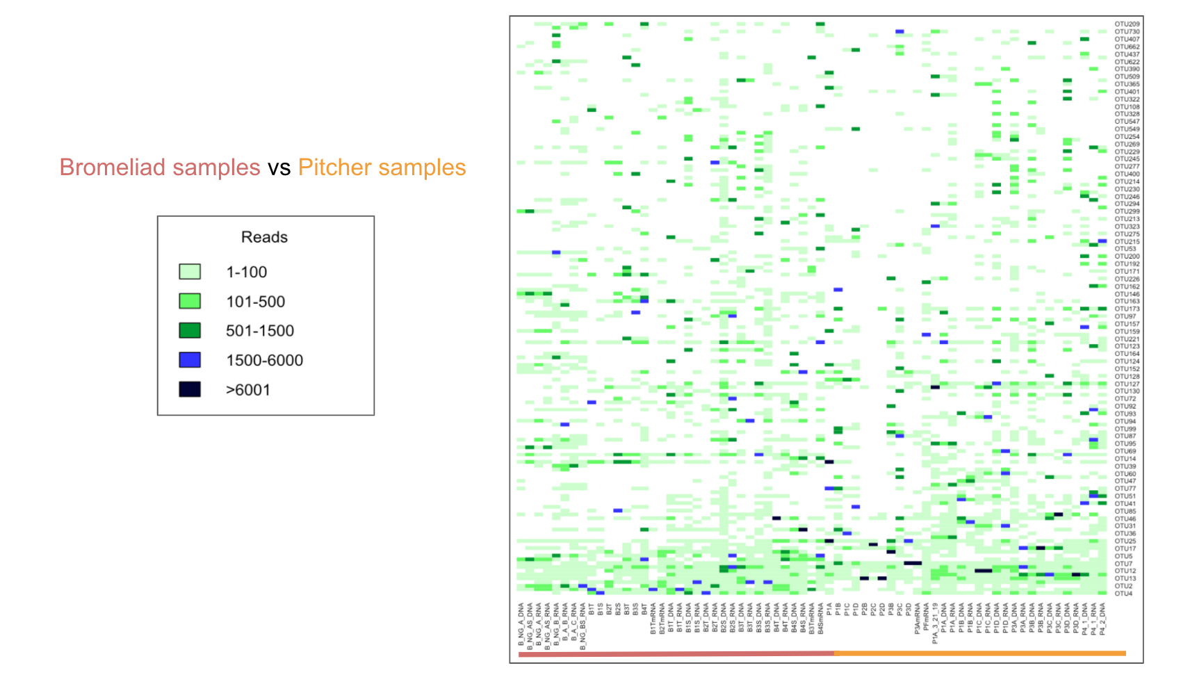
heatmap(d_matrix, Rowv=NA, Colv=NA, cexRow=0.5, cexCol=0.5, col= c("#ccffcc", "#66ff66", "#009933", "#3333ff", "#000033"))
legend(x="bottomright", legend=c("1-100", "101-500", "501-1500", "1500-6000",">6001"), fill=c("#ccffcc", "#66ff66", "#009933", "#3333ff", "#000033"))
OTUs in Nepenthes pitcher plants
Figure 1: Pitcher Plant Samples Rank of Abundance Curve
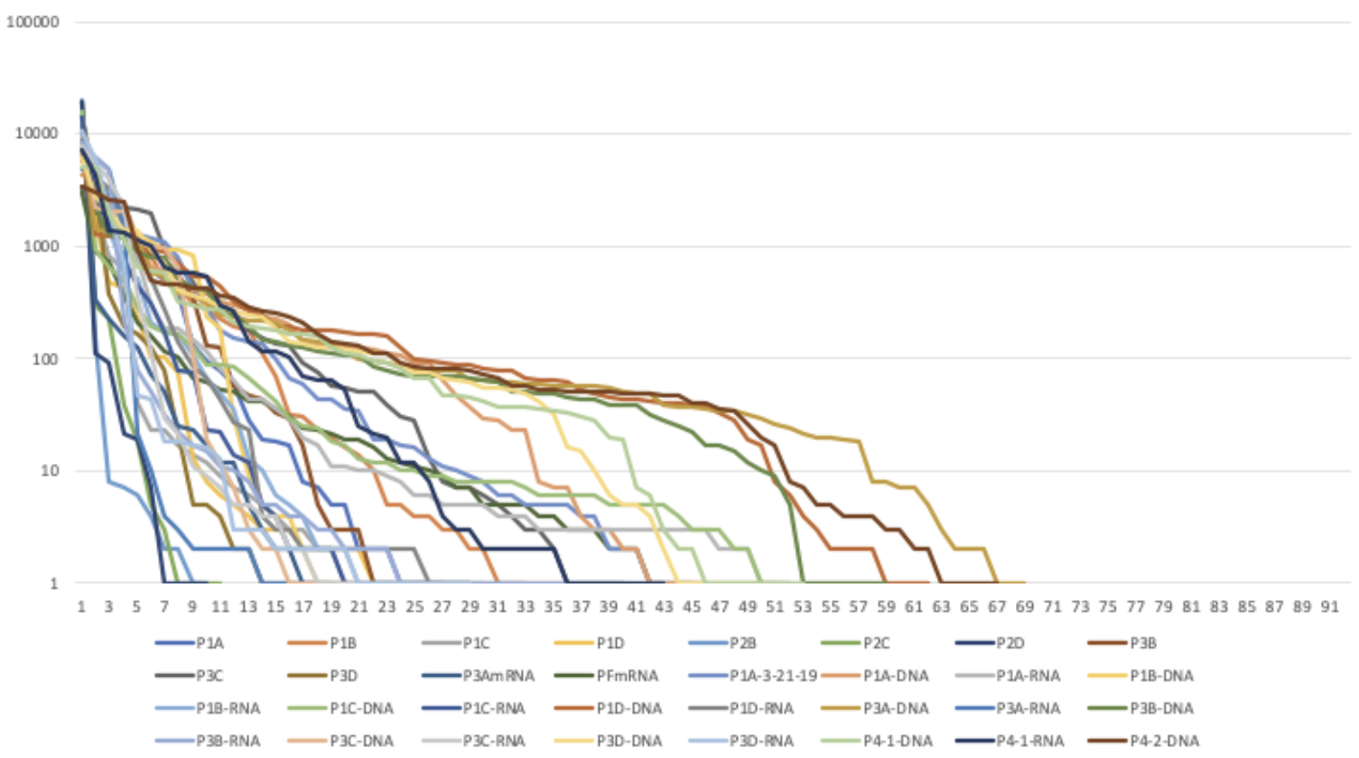
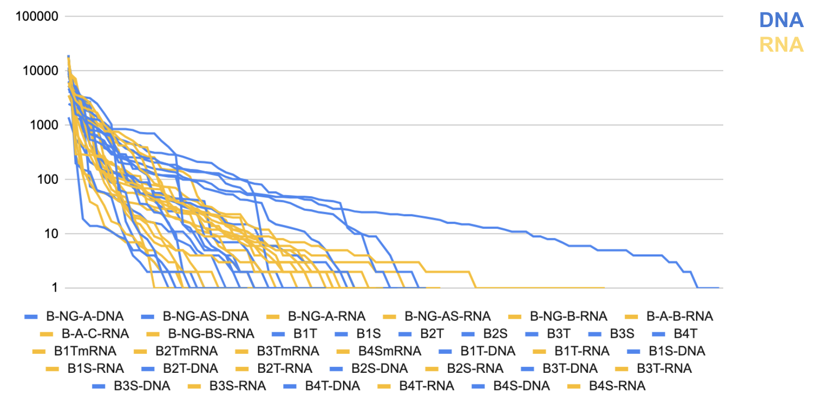
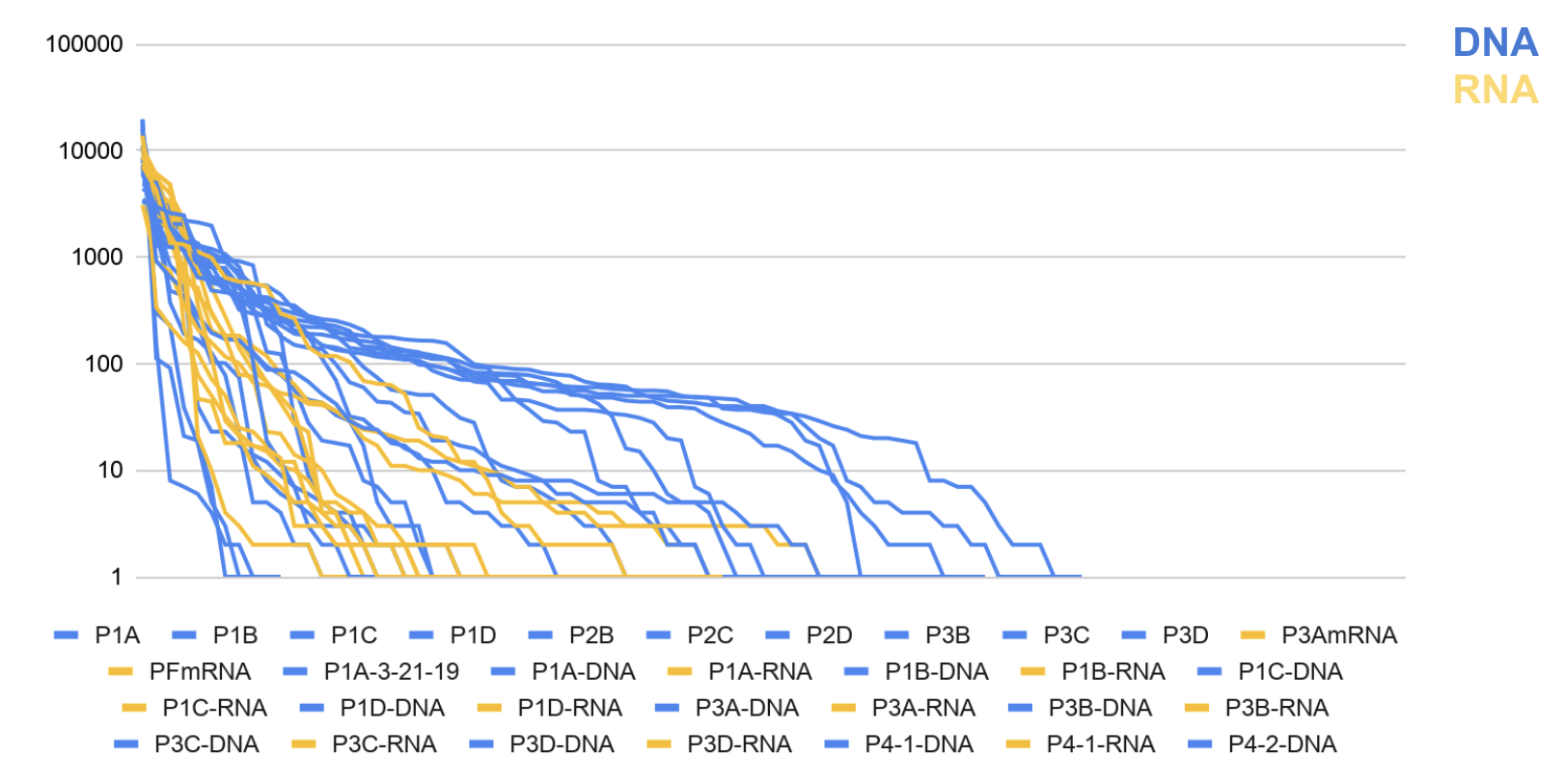
Figure 2: Pitcher Plant DNA vs RNA Rank of Abundance Curve
OTUs in Bromeliads
Figure 1: Bromeliad Samples Rank of Abundance Curve
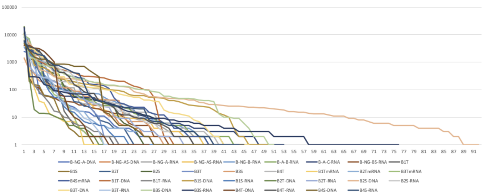
Figure 2: Bromeliad DNA vs RNA Rank of Abundance Curve